Amazon Storefront Product Development

In this blog post I’d like to share some insights from my first Amazon Storefront design for Avanchy.
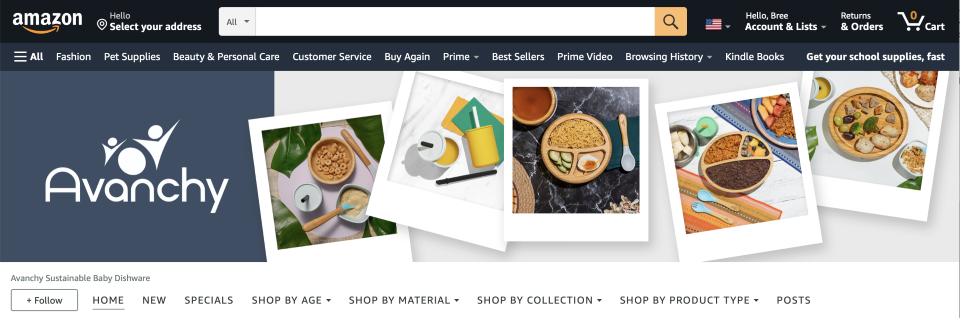
Looking at Avanchy’s existing structure, we saw that it wasn’t as effective as it could be. There were some obvious things missing from the original storefront design. Some of these things were already on the client’s radar. For example, the client knew they wanted to incorporate a ‘Specials’ page where users could always check back for specials and sales. The client also wanted to make sure that their new collection was featured in the navigation. We could have just implemented the clients requested changes and they would have been pleased. But, I saw untapped potential.
I put myself in the user’s shoes, and imagined the different intentions they may have while visiting this site. I identified that, they may visit often and want to know what’s new. They might be looking for a specials/sale. They might be trying to find products for a specific age range/feeding stage. They might be looking for a specific material. They might want to invest in a curated Avanchy collection as a gift or for themselves. Or they might be looking for a specific product type. These thoughts about the Avanchy user experience, informed my recommendations throughout the re-design.
Improving the structure was the foundation of my strategy to make Avanchy’s Amazon Storefront more shop-able and user-friendly.

-
• Home
• New Releases
• La Petite
• Suction Bowls
• Suction Plates
• First Stage Utensils
• Rainbow Gift Set
-
• Home
• New
• Specials
• Shop By Age (Drop-Down)
• Shop By Collection (Drop-Down)
• Shop By Product Type (Drop-Down)
I’m learning as I go.
In our new structure, I utilized drop-down menus to further organize content under each category. What I didn’t realize was that in organizing the content in this way, Amazon would automatically create a page for each category when a drop-down menu was created. I wasn’t initially planning to have a page for each category. Surprise, the scope of the project just expanded!
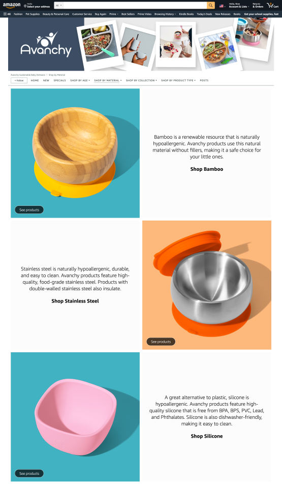
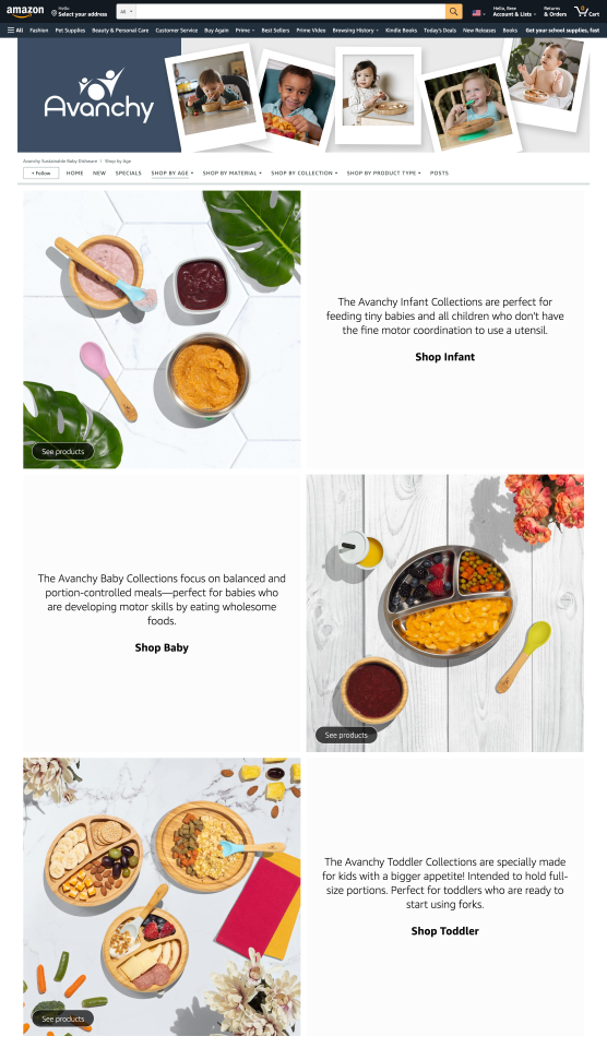
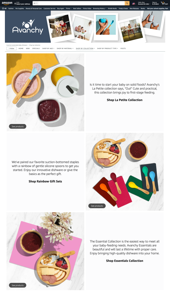
Although I didn’t set out with the vision of creating category pages for each drop down, it didn’t break the project. Using the principle of repetition, I represented to each sub-category with a shop-able product image, a text blurb, and a CTA that would bring users to that sub-category.


Category Pages
When you experience each category page side-by-side, it is easy to see how the repetition of alignment and tile type aid in comprehension and trust in the predictability of how each page will function across the site. This decision also meant that I was able to re-use images that I created for the home page, which increased efficiency as I didn’t have to create and export additional assets for all of the category pages.
Additional areas I set out to improve in the redesign:
-
A lack of consistency was an issue throughout the design. For example, text overlays appeared in any number of locations over the photos. This required your eye to bounce around to take in content. I wanted to streamline this experience so that users could effortlessly engage with the content as they scroll.
-
Creating engaging content was important in both senses of the word. Users would need to be able read and understand the content, yes. But they would also need to be able to easily interact with it. In fact, according to Amazon, each Tile (image, graphic, or text blurb) should support some level of action-oriented engagement whether it’s shopping directly or navigating to a shop-able page. I wanted to design a layout to support these different levels of engagement throughout the Storefront.
-
The original design incorporated a mixture of old and new assets. I had the unique opportunity of being able to update them all. I had access to beautiful photography, taken in-house by our team. And I wanted to use those assets to create composite images for each banner to add a whole new dimension of visual impact for the brand.
Enjoy what you’ve seen so far? Cool, so did the client!
The client said that when he showed it to his wife, she said “You’re the real deal now!” Providing this kind value for the people - this is what motivates me as a creative professional. I believe thoughtful design can make a practical difference for businesses like Avanchy.